
First off, I apologize for the sad photo of a dog, that was not fair, but if you’re like one of the many B2B marketers out there with less than stellar form conversion rates, this might be how you feel.
Form abandonment occurs when the visitor filling out a contact form on your website leaves without submitting, leaving you with no information and canceling out all the hard work it took to get them there in the first place. This leads to more questions than answers – who were they? Why did they abandon the form? Where did they go? Will they ever come back?
“All I wanted was an ebook download, why do they need my mother’s maiden name?”
From a website visitor’s perspective, their personal data is like gold – they guard it closely, dole it out as little as possible, and when they do, they expect to be given something valuable in return. Gated content is a fantastic method for collecting information from website visitors, and is a strong first-party intent signal that indicates a potential buyer’s interest and gives them something they want in exchange for their precious data.
However, you never want a user to ask themselves, “Why are they asking me for that?” when filling out your form. Asking for too much unnecessary information will annoy prospective customers. If users feel like you’re asking for something you don’t need, there’s a good chance they’ll abandon the form. So, how do we fix this?
1. Keep it Short and Sweet
Shorter forms tend to lead to more conversions (i.e. more people starting and actually following through with their form submissions). In fact, some research shows that reducing the number of form fields down to 4 or less can increase conversion rates by up to 160%. Granted, certain kinds of forms will be longer by design. An online survey will likely have more fields than a whitepaper download form, but this is not an excuse to get greedy. Focusing on only the information you actually need from users is crucial to keeping the form submission process as streamlined and painless as possible.
Let’s look at an example:
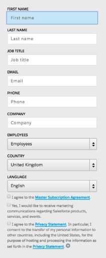
This might not be the worst form I’ve ever seen, but it’s definitely not the best. Asking for things like job title and phone number is not absolutely necessary to make the form effective, and firmographic data like employee count and country are easily attainable through certain data enrichment technologies (more on that later). All totaled there are 12 actions required to submit this form – well above average and rife with unnecessary requests for information.
Now let’s look at a better example:
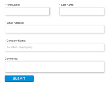
This form may not be perfect, but it's much simpler, with a total of 5 fields and only 4 required to submit. What’s more, the form is not asking for anything extra, only the information sales or marketing really needs to take the next step. I can only speak for myself, but looking at these two forms I know which one I would be more likely to complete.
When you’re designing (or redesigning) your website forms, try to think of things from a user’s perspective. If the only reason you’re asking for things like job title and company employee count is to save you the 30 seconds it takes to do a LinkedIn search, that’s going to be reflected in your conversion rates. Keep in mind that in most cases, the average salesperson can do quite a lot with just a name and company email address. Making it as easy as possible for visitors to give you that information will ultimately increase your conversion rates and get more leads to your sales and marketing teams.
2. Enrich Your Form - Let the Robots do the Work.
Ok, it’s not technically “robots”, but you get the idea. Services like Marketo and Eloqua offer autofill features that use the website visitor’s IP address to automatically fill in fields like company name, industry, revenue, employee count, and more – making it easier for the visitors to complete the form. This also allows you to ask fewer questions while still gathering the important account-level information you need.
Now instead of overwhelming visitors with a barrage of questions to get their data, your forms can become a quick and painless process that provides value to both parties.
3. Leverage Partial Form Fills.
Even the best forms get abandoned, it’s sad but it’s true. However, using IP lookup technology, firmographic data can automatically be saved even if the user abandons the form – ensuring you still get the information you need either way. While partial form fills may not be as “valuable” as fully submitted forms, the mere fact that the user began the form in the first place can be an intent signal that they are in the market to buy and can be factored into an account or lead score.
4. If You Have to Make Your Forms Long, Make Them Feel Shorter.
It’s easy for me to just tell you to make your forms shorter and call it a day, but that's not realistic for everyone. If the information you really need out of a form would still make it longer than Rapunzel’s hair, all is not lost.
Here are a couple of tips to help make long forms seem shorter to your website visitors:
- Multi-Step Forms: Breaking the form up into smaller sections or steps can make it feel less overwhelming and decrease the psychological friction associated with seeing a page of empty fields.
- Horizontal Layout: Using a horizontal layout (i.e. placing more than one field on each line of the form) will trick the eye into perceiving it as shorter.
5. Test, Improve, Convert.
The key to creating effective forms (and probably applicable to life, in general) is to never become complacent. Once you’ve created a website form, conducting ongoing A/B testing across multiple variables like length, CTAs, and layout will give you data about exactly which forms have higher conversion rates. This kind of testing can also show you where in the process people are abandoning the form and give you an idea of what you might need to improve.
The key to effective sales and marketing is being able to see things from your visitor’s perspective, and form conversion optimization is no different. All the hard work and money you spent to get them onto your website should extend to your forms as well. Creating a more user-centric design to your forms will not only make your life easier but will also ensure that your forms (and Marketing team) don’t feel like the sad dog in the photo.